To make review widgets and a WhatsApp button work together on mobile, test the product page on a real phone with the sticky add-to-cart bar, cookie banner, cart drawer and keyboard all active. The price, variant picker and add-to-cart must stay visible and tappable in every state. If the chat button overlaps the sticky bar, move it up or switch to an inline button.
Here's what usually happens. Each app looks great in its own settings preview. Then you install four of them, open the store on a phone, scroll down, and the WhatsApp button is sitting on top of "Add to cart", the review badge is shoved under a discount popup, and the cookie banner covers both. Nobody designed that screen. It just accumulated.
A storefront button starts the conversation. In WhatFlow Business API, the team can then claim the chat, check Shopify order context and share a catalog item if the buyer needs help choosing. That's the difference I'd test between a button-only app and a button with a commerce workspace behind it. See the product-sharing walkthrough.
Why do these elements collide on phones?
Desktop has room. A phone has one bottom corner that every app wants. Floating chat buttons, sticky buy bars, cookie notices, "spin to win" popups and back-to-top arrows all default to the bottom of the screen, because that's where thumbs are. Most of them only appear after scrolling or after a delay, so a quick glance at the top of the page misses the problem completely.
The 15-minute mobile collision test
Grab your actual phone (not a desktop browser squeezed narrow) and pick two products: your best seller and the one with the longest title and most variants. Then go through this list.
Land fresh. Open the product link in a private tab so the cookie banner and any popup appear. Can you see the price and the add-to-cart button without dismissing anything? Can you dismiss things easily?
Pick a variant. Choose a size and colour. Does anything float over the selector or the "out of stock" message?
Scroll down. Watch for the sticky add-to-cart bar to appear. Does it land on top of the chat button, or under it?
Tap the star rating. Does it jump to the written reviews? Can you get back up to the buy button easily?
Open a photo review. Is there a visible close button? Is it big enough to hit with a thumb?
Open the cart drawer. Is the checkout button clear of the chat button?
Tap the WhatsApp button. Does it open WhatsApp with a sensible prefilled message? When you come back, is the selected variant still selected?
Bring up the keyboard. Tap the search or a discount-code field. What gets pushed off screen?
Turn up text size in your phone's accessibility settings and repeat steps 1 and 3.
Screenshot every collision. It takes about 15 minutes and you'll almost certainly find at least one.
Rule 1: purchase controls win every conflict
Price, variant selector, quantity and add-to-cart are the reason the page exists. Nothing optional should ever sit on top of them, at any scroll position.
If the floating chat button and the sticky buy bar both want the bottom of the screen, the chat button moves. Most button apps let you change the corner and the vertical offset. If yours doesn't, or your theme's sticky bar is tall, consider dropping the floating button on product pages and using an inline button placed near the product description instead.
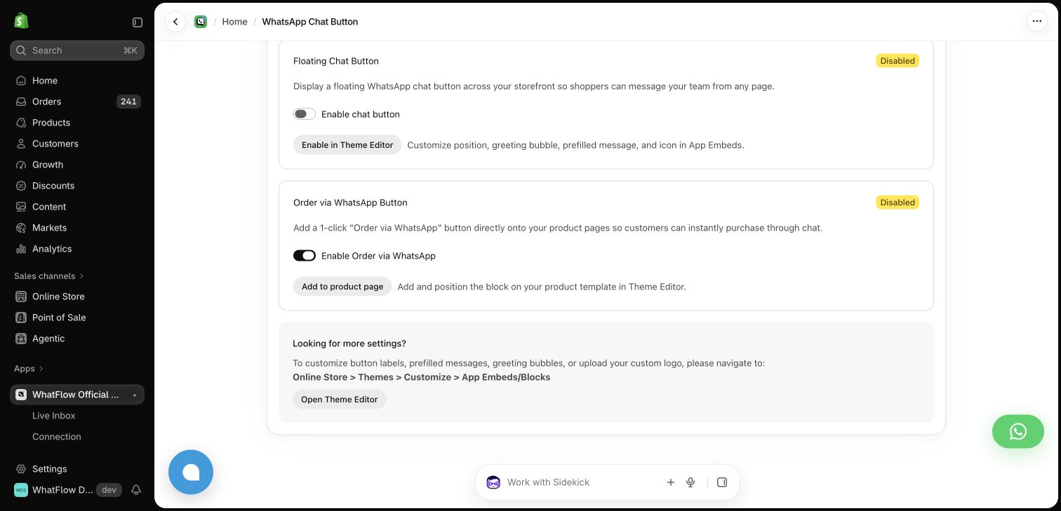
WhatFlow's buttons give you both options. The floating chat button's position, greeting bubble, prefilled message and icon are set in your theme's App Embeds, and there's a separate product-page block you place in the Theme Editor wherever it fits your layout. The buttons are theme-matched and free forever.
WhatFlow chat button settings in the demo store. Both buttons shown disabled.
Rule 2: reviews should be one tap from the decision
A compact star rating under the product title is a good summary. It only helps if tapping it actually takes the shopper to the written reviews. Some theme and widget combinations do nothing on tap, which feels broken.
Then check the full review section. On mobile I'd want:
The written reviews visible without opening another layer.
Photos that open in a viewer with an obvious close button.
A way back to the buy button that doesn't involve scrolling past 40 reviews.
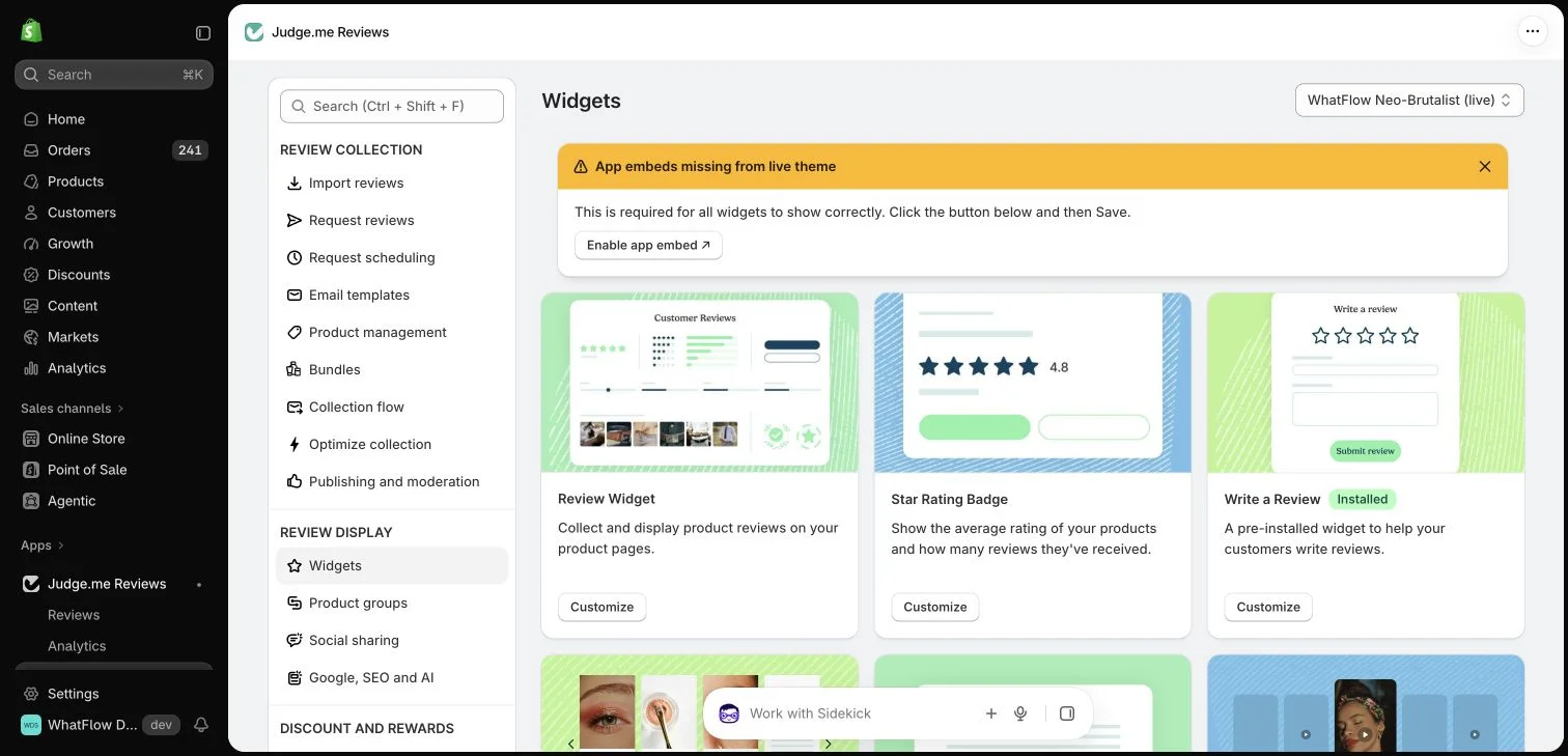
Most review apps, Judge.me included, offer several widgets (a review section, a star rating badge, carousels) and let you choose which appear. Fewer is usually better on mobile.
Judge.me widget settings in the WhatFlow demo store.
Small close buttons are the most common mobile annoyance I see. WCAG 2.2 sets a minimum tap target of 24 by 24 CSS pixels at level AA, unless the target has enough space around it (W3C). Treat that as a floor, not a goal.
A few more basics:
An icon-only WhatsApp button needs an accessible label ("Chat with us on WhatsApp") so screen readers announce it.
Don't signal "sold out" by colour alone. Say it in words.
Make sure no overlay traps the shopper. Every layer needs a way out.
Rule 4: one floating thing per corner
If you have a chat button, a back-to-top arrow and a rewards launcher, you don't need all three floating. Pick the one that matters most on that page. On product pages, for most stores I talk to, it's the chat button, because a pre-purchase question is often the last thing between a shopper and the order. The rewards launcher can live in the menu.
Same goes for badges. A wall of trust icons pushes real information down the page. Our post on whether trust badges work argues for showing evidence instead.
Keep a regression habit
Layouts break silently. A theme update changes the sticky bar height. A new app adds a popup. Someone turns on a holiday banner. Rerun the 15-minute test whenever you:
Update or change your theme
Install or reconfigure an app that adds anything visible
Launch a sale with new banners or popups
Keep your screenshots in a shared folder (with no customer data in them) so you can compare before and after.
Free plan available
Run WhatsApp for your Shopify store with WhatFlow
Templates, COD confirmation, Shopify Flow automations and a shared team inbox with no seat fees. Every feature is included on every plan, including Free.
Run the test today on your best-selling product. Fix the worst collision first, almost always something covering add-to-cart. Once the layout is stable, you can start testing social proof placement properly, and work through the rest of the product-page trust checklist.
Frequently asked questions
Where should a WhatsApp button go on a mobile store?
Bottom corner is fine as long as it doesn't overlap the sticky add-to-cart bar, cart drawer or cookie banner. If your theme has a sticky buy bar, raise the button above it or use an inline button on the product page instead of a floating one.
Why is my WhatsApp button covering the add to cart button?
Usually because a sticky add-to-cart bar or a banner appears after scrolling and occupies the same bottom area as the floating button. Adjust the button's position or offset in your theme's app embed settings and retest with the bar visible.
How big should tap targets be on mobile?
WCAG 2.2 sets a minimum of 24 by 24 CSS pixels for pointer targets at level AA, unless they have enough spacing around them. Close buttons on popups are the usual offenders.
Where should star ratings appear on a product page?
A compact star rating near the product title works well as a summary, as long as tapping it takes shoppers to the written reviews. The full review section usually belongs below the product description.