
Good WhatsApp quick reply buttons ask one question and say exactly what each tap does. You get up to three buttons of 20 characters each, so every label has to describe a real next step: "Confirm order", "Change address", "Talk to us". If a customer could tap a button and still not know what happens, the label is wrong.
Buttons are the fastest way to get a clear answer from a customer on WhatsApp. They're also the easiest way to create confusion at scale, because a vague label gets tapped hundreds of times before anyone notices. Here's how I'd design them.
What are WhatsApp quick reply buttons?
A quick reply button is a tappable option attached to a WhatsApp message. When the customer taps it, WhatsApp sends that button's text back to you as their reply, plus a hidden value (a payload) your automation can read.
There are two places they show up:
- Inside an approved template. This is how you send buttons outside the 24-hour customer service window, for example with a COD confirmation sent right after checkout. The buttons are part of the template Meta reviews.
- Inside an interactive message. Free-form, sent during an open customer service window (the 24 hours after the customer last messaged you). Meta's reply buttons documentation allows up to three buttons, each label up to 20 characters, and the labels must be different from each other.
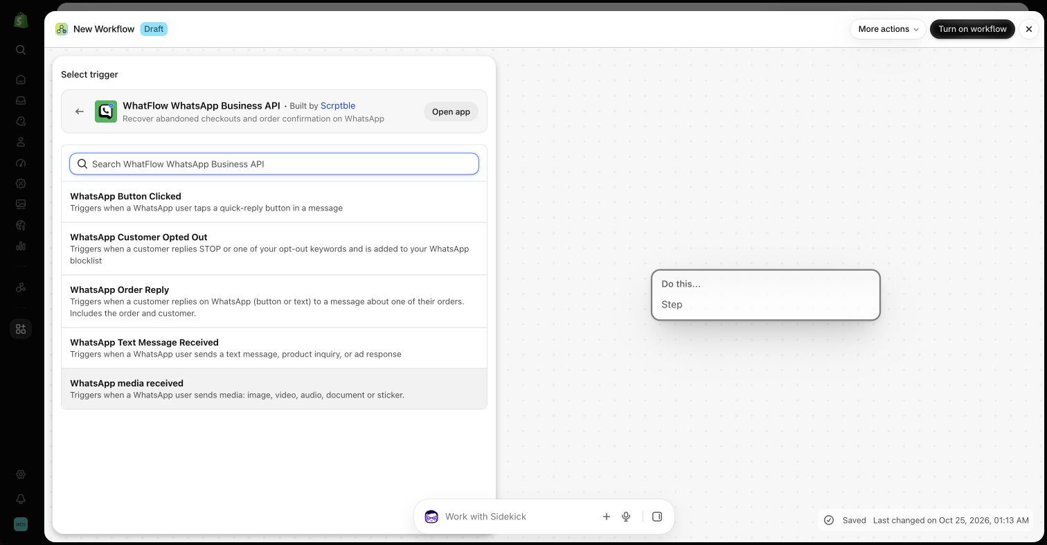
WhatFlow's interactive-button action in Shopify Flow follows the same three-button limit. Honestly, three is plenty. If you need more, you're asking more than one question.
Ask one question per message
The most common mistake: a message that asks two things and offers buttons for neither.
Hi Ayesha, your order #1042 is ready. Is the address correct and do you still want it? [Yes] [No]
"No" to what? The address or the order? Your team will have to message her anyway, and you've used a template send to learn nothing.
Split it into one decision:
Hi Ayesha, thanks for your order #1042 (Rs 4,850, cash on delivery). We'll dispatch it tomorrow to: House 12, Street 4, DHA Phase 5, Lahore.
Please confirm so we can ship it.
[Confirm order] [Change address] [Cancel order]
Each button maps to one action. Nobody has to interpret anything.
Write labels that describe the consequence
A button is a promise. If "Cancel order" only adds a review tag and a person decides later, the customer thinks her order is cancelled when it isn't. That's how you get angry follow-ups and refused parcels.